When you say "better quality", what do you mean by that?aeffertz wrote:The only one I'd probably do is the CRF logo. Like others have mentioned, I'd just find better quality logos and slap them on. There's no need to draw/trace logos.John23 wrote:Alright. Thank you so much. There's a lot of complicated logos. Gonna take a long time to trace 'emOhagan75 wrote:copy it from illustrator into photoshop and it will give you an option about what to import it as. just select smart object.
Upcoming Skins and Shader Maps #2
Re: Upcoming Skins and Shader Maps #2
jlv wrote:This post is useless.
Re: Upcoming Skins and Shader Maps #2
lmao sorry to ruin your guys' conversation but here is something that im starting on this is just the shroud but im taking my time with this one to make sure it comes out looking good

Re: Upcoming Skins and Shader Maps #2
John - logo with good quality of image (no visible artifacts = "problems")  and resolution high enough so you only need to scale it down, never up....and of course what is important if the logo has a background you need to cut it out clean. (Better to get the logo in png with transparent background)
and resolution high enough so you only need to scale it down, never up....and of course what is important if the logo has a background you need to cut it out clean. (Better to get the logo in png with transparent background)
Re: Upcoming Skins and Shader Maps #2
To add on to was Piista said, never never NEVER use the magic wand selection tool for logos. You will get noisy and different color artifacts around the edges.
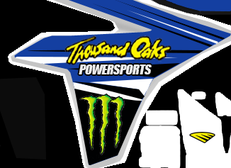
Unfortunately for Blake here I will use his post for an example. You see how the monster logo has little bits of white around it? Or how about the "Thousand Oaks", compare those to the power sports font. Not very smooth and clear are they.
It's what separates a thrown together kit vs a well done kit.
Re: Upcoming Skins and Shader Maps #2
how should i select the logos then?m121c wrote:To add on to was Piista said, never never NEVER use the magic wand selection tool for logos. You will get noisy and different color artifacts around the edges.
Unfortunately for Blake here I will use his post for an example. You see how the monster logo has little bits of white around it? Or how about the "Thousand Oaks", compare those to the power sports font. Not very smooth and clear are they.
It's what separates a thrown together kit vs a well done kit.
Re: Upcoming Skins and Shader Maps #2
i just want this to come out as good as it can be so any tips or help is appreciated
Re: Upcoming Skins and Shader Maps #2
i use the magic tool pretty often, but you need to clean the selection manually (or with refine edge...careful with this) after to make sure there are no background leftovers
Re: Upcoming Skins and Shader Maps #2
Search for vectors of the logos. No manual work needed. For something like a monster logo it will be easy to find, but something like the thousand oaks logo, I would either trace it or find a large image of it and cut it out nicely.Blake_901 wrote:how should i select the logos then?m121c wrote:To add on to was Piista said, never never NEVER use the magic wand selection tool for logos. You will get noisy and different color artifacts around the edges.
Unfortunately for Blake here I will use his post for an example. You see how the monster logo has little bits of white around it? Or how about the "Thousand Oaks", compare those to the power sports font. Not very smooth and clear are they.
It's what separates a thrown together kit vs a well done kit.
Re: Upcoming Skins and Shader Maps #2
ok thank youm121c wrote:Search for vectors of the logos. No manual work needed. For something like a monster logo it will be easy to find, but something like the thousand oaks logo, I would either trace it or find a large image of it and cut it out nicely.Blake_901 wrote:how should i select the logos then?m121c wrote:To add on to was Piista said, never never NEVER use the magic wand selection tool for logos. You will get noisy and different color artifacts around the edges.
Unfortunately for Blake here I will use his post for an example. You see how the monster logo has little bits of white around it? Or how about the "Thousand Oaks", compare those to the power sports font. Not very smooth and clear are they.
It's what separates a thrown together kit vs a well done kit.
Re: Upcoming Skins and Shader Maps #2
And if you can't find a vector, try to find a high res PNG with a transparent or solid color background. I've found the "magic background eraser" in photoshop does a fine job with those.m121c wrote:Search for vectors of the logos. No manual work needed. For something like a monster logo it will be easy to find, but something like the thousand oaks logo, I would either trace it or find a large image of it and cut it out nicely.Blake_901 wrote: how should i select the logos then?

Re: Upcoming Skins and Shader Maps #2
awesome thank you guysaeffertz wrote:And if you can't find a vector, try to find a high res PNG with a transparent or solid color background. I've found the "magic background eraser" in photoshop does a fine job with those.m121c wrote:Search for vectors of the logos. No manual work needed. For something like a monster logo it will be easy to find, but something like the thousand oaks logo, I would either trace it or find a large image of it and cut it out nicely.Blake_901 wrote: how should i select the logos then?
Re: Upcoming Skins and Shader Maps #2
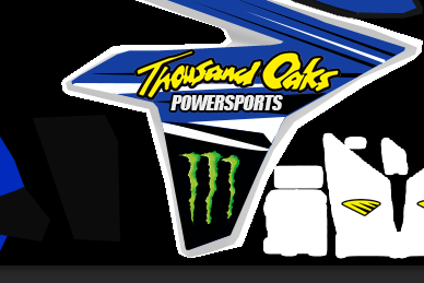
getting the vector logo for monster was not hard at all and for the thousand oaks logo i got a bigger logo and cut it nicely IMO and IMO i think it looks better than my previous version thank you guys for your help and tips
-
GlebVolkov
- Posts: 283
- Joined: Sat Feb 28, 2015 9:35 pm
- Team: Impact
- Location: Russia
- Contact:
Re: Upcoming Skins and Shader Maps #2
Better like that 
10th 2015 EMF Pro Outdoors 450 | 3rd 2015 EMF Italian Pro Championship
-
lars@crossmag
- Posts: 421
- Joined: Thu Nov 14, 2013 10:05 pm
- Location: The Lab
- Contact:
Re: Upcoming Skins and Shader Maps #2
After only posting Screenshots on these forums lately I finally found some free time to make gear again haha  It's the Shift Faction line of 2016 this time.
Since I want the stuff I make to be spot on I wanna ask you guys for help! I already looked at numerous reference images of this particular gear and still can't figure out how to align the logo and the big red shape on the left shoulder correctly.
(I hope you understand what I'm trying to say but I also highlighted the part on the gear I can't figure out on this W.I.P. preview in case you don't.)
I'd be more than happy for any kind of help rather if it's a good reference Image or anything else! Feedback is also much appreciated! Thanks already!

Higher quality: http://i.imgur.com/oYo66NG.jpg
Since I want the stuff I make to be spot on I wanna ask you guys for help! I already looked at numerous reference images of this particular gear and still can't figure out how to align the logo and the big red shape on the left shoulder correctly.
(I hope you understand what I'm trying to say but I also highlighted the part on the gear I can't figure out on this W.I.P. preview in case you don't.)
I'd be more than happy for any kind of help rather if it's a good reference Image or anything else! Feedback is also much appreciated! Thanks already!
Higher quality: http://i.imgur.com/oYo66NG.jpg
