Post about creating and skinning models here
Boblob801
Posts: 3998Joined: Mon Nov 16, 2009 4:59 amTeam: <3 AndyLocation: New Zealand
Contact:
Post
by Boblob801 Sun Sep 10, 2017 11:35 pm
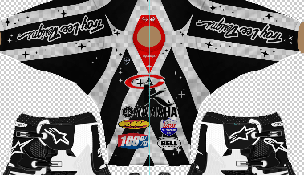
Mr. Wiggles wrote: MOTOZ293 wrote: Way too many logos...
True true kind of got cared away (I had nothing else to do)
Meh doesn't matter, I always felt like the more logos the more factory you were.
AHeckman2
Posts: 2920Joined: Thu Aug 06, 2015 12:11 amTeam: Heckman ProductionsLocation: Michigan, USA
Contact:
Post
by AHeckman2 Mon Sep 11, 2017 12:16 am
Boblob801 wrote: Mr. Wiggles wrote: MOTOZ293 wrote: Way too many logos...
True true kind of got cared away (I had nothing else to do)
Meh doesn't matter, I always felt like the more logos the more factory you were.
*left turn*
KTM57
Posts: 13865Joined: Wed Jul 07, 2010 2:42 amLocation: TX
Contact:
Post
by KTM57 Mon Sep 11, 2017 2:56 am
Mr. Wiggles wrote:
What do you mean I haven't touched that area
Do you have an older version of Photoshop? Some friends had issues with the layer effects and we were thinking it was due to my building the files in the latest CC version. Your colors look very wrong unless you've gone and set different panels to new colors.
This is a block of text that can be added to posts you make. There is a 255 character limit.
T-RIDER
Posts: 1541Joined: Wed Apr 14, 2010 9:56 pmTeam: System Decal
Contact:
Post
by T-RIDER Mon Sep 11, 2017 4:24 am
KTM57 wrote: Your colors look very wrong
Currently setting this as default answer to any graphics kit you send me. okok
Mr. Wiggles
Posts: 1042Joined: Sun Feb 08, 2015 6:41 pmTeam: GSR/137 KidLocation: Bottom Feeder at LCQ Studios
Contact:
Post
by Mr. Wiggles Mon Sep 11, 2017 10:19 am
Boblob801 wrote: Mr. Wiggles wrote: MOTOZ293 wrote: Way too many logos...
True true kind of got cared away (I had nothing else to do)
Meh doesn't matter, I always felt like the more logos the more factory you were.
Thanks Boblob
Bottom feeder at LCQ Studios Internet Nice Guy!
Mr. Wiggles
Posts: 1042Joined: Sun Feb 08, 2015 6:41 pmTeam: GSR/137 KidLocation: Bottom Feeder at LCQ Studios
Contact:
Post
by Mr. Wiggles Mon Sep 11, 2017 10:20 am
KTM57 wrote: Mr. Wiggles wrote:
What do you mean I haven't touched that area
Do you have an older version of Photoshop? Some friends had issues with the layer effects and we were thinking it was due to my building the files in the latest CC version. Your colors look very wrong unless you've gone and set different panels to new colors.
Yes Cs5
Bottom feeder at LCQ Studios Internet Nice Guy!
KTM57
Posts: 13865Joined: Wed Jul 07, 2010 2:42 amLocation: TX
Contact:
Post
by KTM57 Mon Sep 11, 2017 1:16 pm
Word. Maybe there is some sort of compatibility setting I can use next time.
This is a block of text that can be added to posts you make. There is a 255 character limit.
Mr. Wiggles
Posts: 1042Joined: Sun Feb 08, 2015 6:41 pmTeam: GSR/137 KidLocation: Bottom Feeder at LCQ Studios
Contact:
Post
by Mr. Wiggles Mon Sep 11, 2017 6:33 pm
KTM57 wrote: Word. Maybe there is some sort of compatibility setting I can use next time.
Mayyyyyyyyybe
Bottom feeder at LCQ Studios Internet Nice Guy!
Ddavis
Posts: 17987Joined: Wed Sep 28, 2011 1:02 am
Post
by Ddavis Fri Sep 15, 2017 11:23 pm
Is anyone down to make my team a helmet for the '18 SX season? It can be totally custom, but at the same time I want a simplistic look to it, for whatever reason I always seem to struggle with making helmet skins look "right". Preferably I want it on the V4, and if I can get my hands on the V3 that would be good as well. PM me if interested
Mr. Wiggles
Posts: 1042Joined: Sun Feb 08, 2015 6:41 pmTeam: GSR/137 KidLocation: Bottom Feeder at LCQ Studios
Contact:
Post
by Mr. Wiggles Sat Sep 16, 2017 12:56 pm
Is this better?
Bottom feeder at LCQ Studios Internet Nice Guy!
AHeckman2
Posts: 2920Joined: Thu Aug 06, 2015 12:11 amTeam: Heckman ProductionsLocation: Michigan, USA
Contact:
Post
by AHeckman2 Sat Sep 16, 2017 2:47 pm
Hard to see with the black on black logos, maybe try a thicker stroke or just changing the black logos to white. But looks better!
Mr. Wiggles
Posts: 1042Joined: Sun Feb 08, 2015 6:41 pmTeam: GSR/137 KidLocation: Bottom Feeder at LCQ Studios
Contact:
Post
by Mr. Wiggles Sat Sep 16, 2017 8:21 pm
AHeckman2 wrote: Hard to see with the black on black logos, maybe try a thicker stroke or just changing the black logos to white. But looks better!
Okay will do thanks
Bottom feeder at LCQ Studios Internet Nice Guy!
DBRider251
Posts: 2011Joined: Fri Jun 21, 2013 5:38 pmTeam: Elevated Motorsports
Post
by DBRider251 Sat Sep 16, 2017 9:30 pm
Mr. Wiggles wrote: Is this better?
I'd scale the logos down a bit, but that is definitely an improvement
TeamHavocRacing wrote: it's all the liberals fault
Ddavis
Posts: 17987Joined: Wed Sep 28, 2011 1:02 am
Post
by Ddavis Sat Sep 16, 2017 9:46 pm
When it comes to gear, the less logos the better imo.
broland278
Posts: 1252Joined: Sat Dec 20, 2008 4:28 amTeam: MotoSavageLocation: Kansas
Contact:
Post
by broland278 Sun Sep 17, 2017 3:02 am
Something for fun