Post a picture of it under strong lighting. It looks poo brown to me whereas the real thing doesn't although I can see that it's a hard colour to try and replicate in the game.
DCreedz#523 wrote:
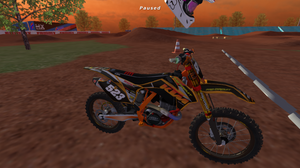
This is a new skin I'm creating.
Feedback Welcome. Things that will be changed:
-The swingarm (obviously)
-The seat
-The airbox graphics (logos will be spaced)
So just let me know what else you think I should add to that list.
P.s- Can someone help me out in the area that I need to get all my logos and skinning less pixelated.
BUMP
So I know it's hard to tell but let me know which side is better.
BUMP-someone give me some feedback. Can someone help me out in the area that I need to get all my logos and skinning less pixelated.
Skinning shouldn't be pixelated if you are using the pen tool properely and use the largest logo size you can find and unless you trace them they will always be pixelated.
0 | 1 | 0 | 4
2014 Loretta Lynns 250 Pro Sport 2nd
Scotty226 wrote:Skinning shouldn't be pixelated if you are using the pen tool properely and use the largest logo size you can find and unless you trace them they will always be pixelated.
nah my skinning isn't pixelated that bad. only my logo's. Look at the front fender
August, on that Adept logo on the shroud i would make it line up with the bottom green line, just something to try not sure how it would look. Other then that it looks sick.
Why does that look like my png just edited really shitty on the old model?