August, on that Adept logo on the shroud i would make it line up with the bottom green line, just something to try not sure how it would look. Other then that it looks sick.
Why does that look like my png just edited really shitty on the old model?
KTM57 wrote:Nope. I made some adjustments to a preexisting set of graphics that I had made and ended up with that shape pattern. Definitely similar, though.
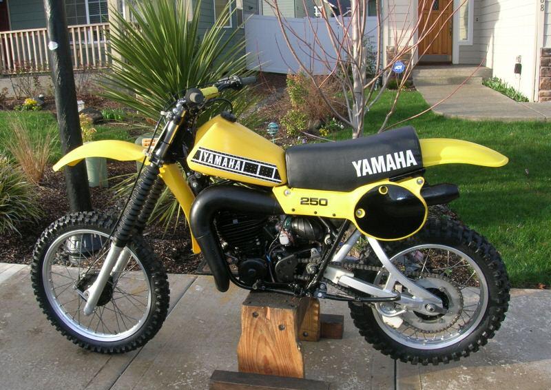
i like it. a modern remake of the old yellow yamis.
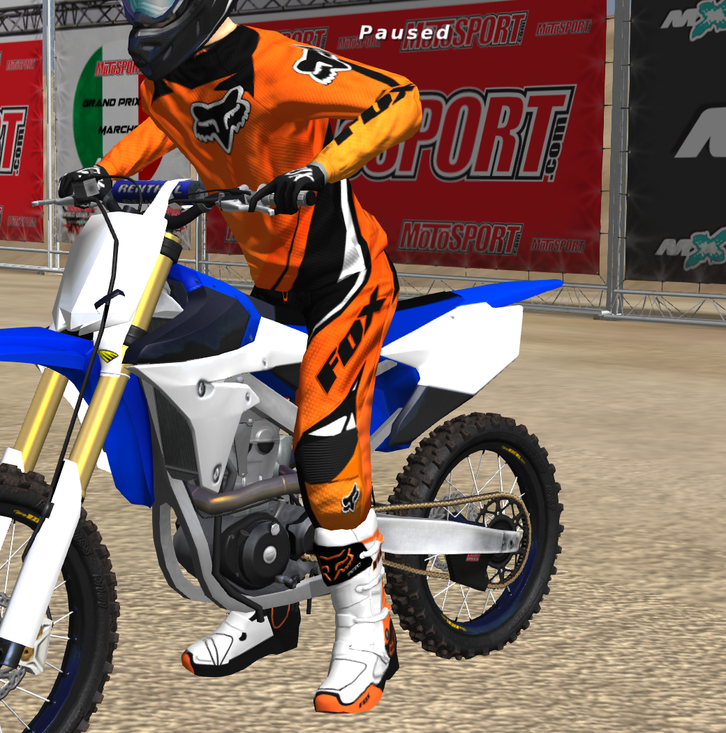
KTM57 wrote:I'm also working on this gear right now. 2012 Fox 360. I'm aware that it's been made already, but I really like the gear and I'd like to use this project to get a good hold on norm and spec maps. I really want to do a new jersey pattern because this one doesn't look as good as I had hoped. I also need to clean up some stitching and do some more stuff, then it's on to the pants. I'm also really proud of the way I got the gradient to match up on the side so well.
Thanks to p2sta for working with me on the model! He actually put reflections on the exact area of the gear that I needed to get a little more shine out of and it works beautifully.
This is a block of text that can be added to posts you make. There is a 255 character limit.