JerryLaw wrote:first stage is done, now it's time to place the logos perfectly, some stitches and bake a norm / spec map + some proper shading

Personally think that the green should be a little more neon.
JerryLaw wrote:first stage is done, now it's time to place the logos perfectly, some stitches and bake a norm / spec map + some proper shading

MXJProductions wrote:I'd rather have a big balls than a hairy chest.... Just sayin
Phathry25 wrote:Long story short, I don't like you. You'll live.
tyrm85 wrote:JerryLaw wrote:first stage is done, now it's time to place the logos perfectly, some stitches and bake a norm / spec map + some proper shading
Personally think that the green should be a little more neon.


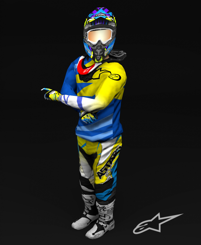
It's not bad for a first skin. You should try making those number plates flow more with the shrouds. And try not to just copy and past any logo onto the bike; when you copy and past like that it makes it kinda pixilated and blurry.vonhooseondon wrote:http://i.imgur.com/jlBBlH8.jpg
First bike skin/graphics kit i have ever made. A little to do still, any suggestions?


You know, I was thinking of doing the mesh on the armpits, but Ive noticed people like Herlings, and Barcia don't have the mesh. Every Pro that wears it doesn't have the mesh, so I just went with that, since I had more references of pros.760Liam wrote:Looks good, but you're missing the mesh that goes near the armpits.