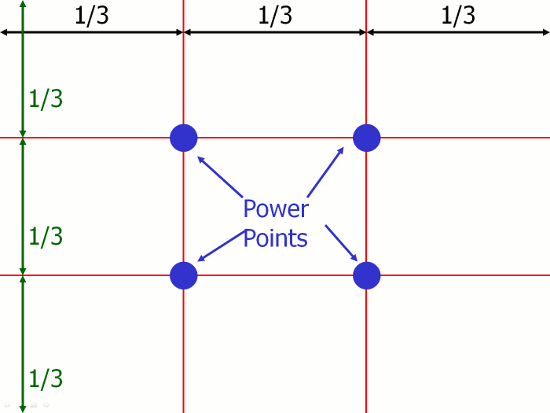
The biggest thing I see that a lot of photographers forget is to remember your thirds. All it means is keep your subject or model in one third of a picture. Using the intersects of the lines as major points. There is symmetry, but the only one I can really see symmetry is the fourth one. So just keep your subject out of the center of the frame, most cameras have a display that can be toggled.
Something else that might improve your shots is how you're posing the model. The last one, the pose is fine. But, I would have her facing towards the left instead of the right. That will light up her hair a lot more and really bring out some colour. Maybe even shade the lens so you don't get glare, and use a reflector on the bottom corner to brighten up the opposite side of her face. The second one there should be a spotlight, optional though. A simple light with a snoot can take away that blend you have between her head and the background.
They're really good portraits, I like how you use your negative space. Just little things that can make them that much better. Keep it up.


